Pantone Colour of the Year 2024: Peach up your life
TEXT: NANE STEINHOFF
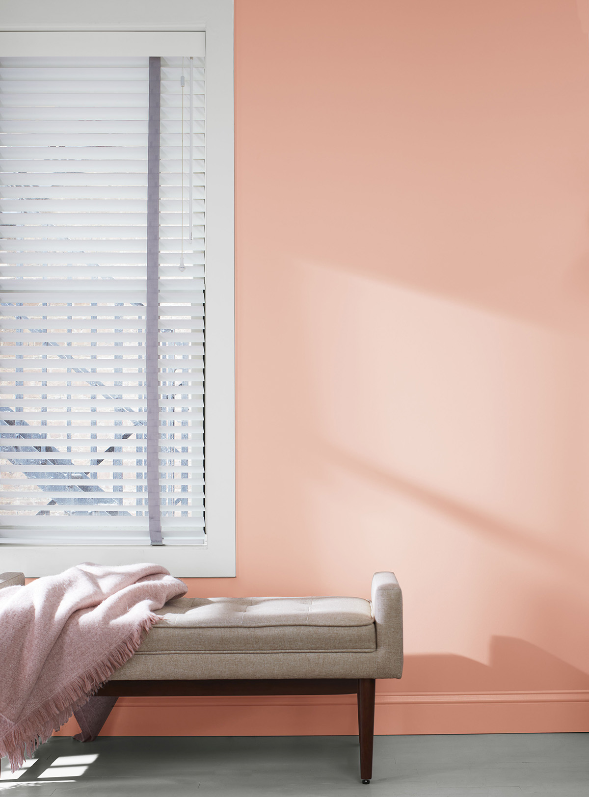
Wall paint ‘Conch Shell’ by Benjamin Moore. Photo: Benjamin Moore UK
Pantone has recently announced their much-anticipated Colour of the Year 2024: Peach Fuzz. The Pantone Color Institute called ‘Pantone 13-1023 Peach Fuzz’ a comforting colour that is ‘softly nestled between pink and orange’. But why is their annual colour choice so important to the design world and how is the much-anticipated hue chosen?
Headquartered in New Jersey in the USA, Pantone is an American company that is most famous for the so-called Pantone Matching System (PMS), a tool that facilitates colour management in physical and digital formats. It is widely used in printing, the fashion industry, product design, graphic design, as well as manufacturing. PMS ensures consistent and accurate colours when used throughout various applications, thereby making it an invaluable tool for brands all across the globe.
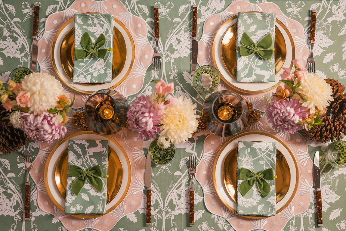
Apricot Flower Placemat by Truffle Tablescapes. Photo: Truffle Tablescapes
Since 1999, the Pantone Color Institute has been choosing a special ‘Color of the Year’. The idea was to engage more people in the design community and get them talking about different colours. Laurie Pressman, vice president of the Pantone Color Institute, explained: “We wanted to draw attention to the relationship between culture and colour. We wanted to highlight to our audience how what is taking place in our global culture is expressed and reflected through the language of colour. This thought process rings just as true today just as it did back in 1999. That’s one of the major reasons why, each year, so many around the world look forward to our Pantone Color of the Year announcement.”
Since then, the global colour experts at the Pantone Color Institute constantly look for new colour influences in various fields, such as the entertainment industry, fashion collections, different design industries, new technologies, textures, social media, sporting events, and many more. “Anything and everything taking place in our culture during the year can influence our Pantone Color of the Year selections for the upcoming year with each source carrying a different weight from year to year, depending on what is taking place in our culture at that time,” adds Pressman. “For example, if you look back to 15 years ago, technology would have played an infinitesimal role. Today that is no longer the case. Gaming, social media, AR and physical design itself are all influenced by our technology and the colours we can access in the digital environment.”
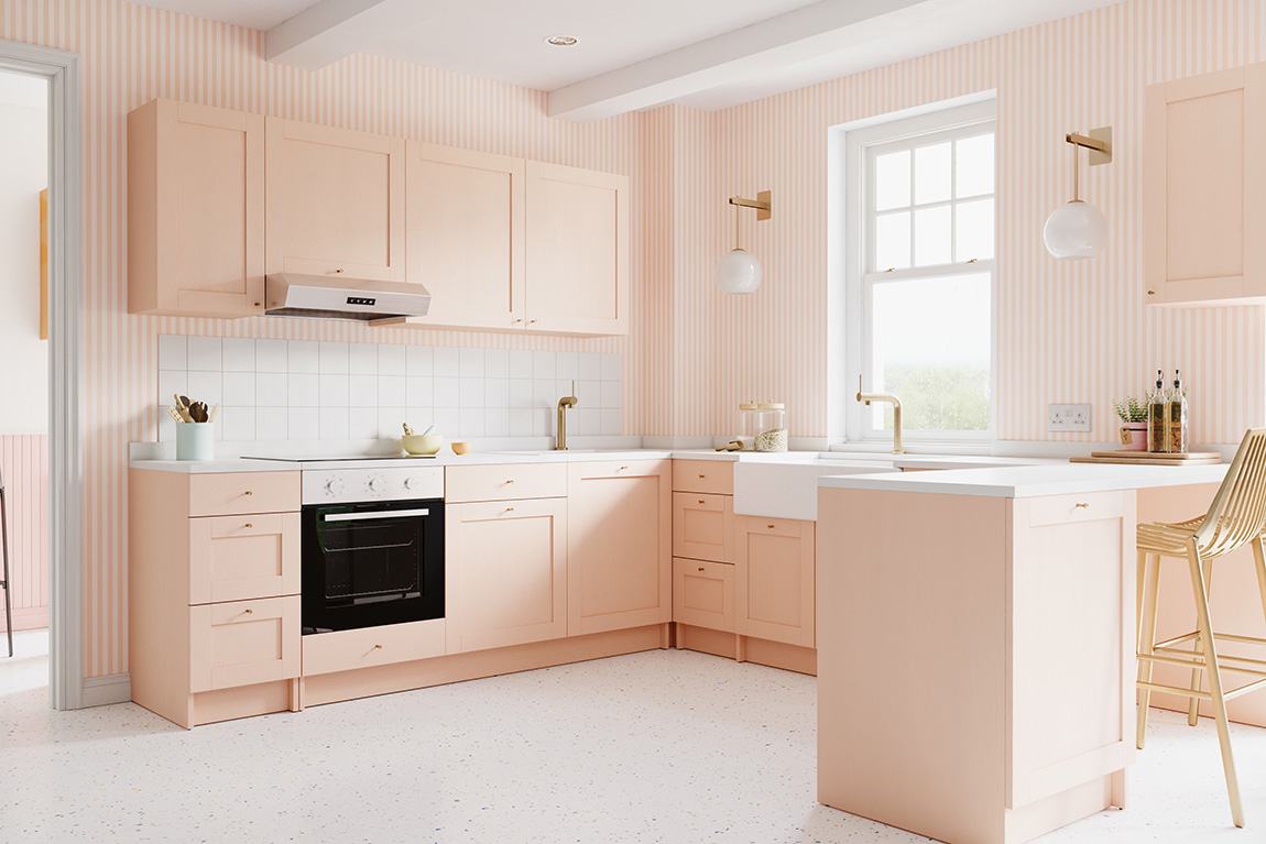
Peach Fuzz kitchen by Bobbi Beck. Photo: Bobbi Beck
Peach Fuzz
In 2024, the chosen colour is ‘Pantone 13-1023 Peach Fuzz’. In its official press release, Pantone called it a “velvety gentle peach tone whose all-embracing spirit embraces the mind, body, and soul”. It was chosen to express a yearning for community and cosiness during uncertain times. Pressman explained that the choice was influenced by the “unusual time we continue to find ourselves living in. As we enter 2024, how we live and the concept of lifestyle has taken on new meaning.” She continued: “It is a colour that is heartfelt and one that people can draw comfort from.”
The colours chosen annually tend to be colours that bring together all areas of design and that are bigger than just one region, according to Pressman. It is a colour “that serves as an expression of a mood and an attitude on the part of the consumers, a colour that will resonate around the world”. She explained: “That’s the difference between a more short-lived fad and a lifestyle trend. Pantone Color of the Year is reflective of a lifestyle trend. It’s about what’s happening in the zeitgeist at a macro level. It is critical that we make sure that the colour really reflects what’s taking place in the global culture at that moment in time.”
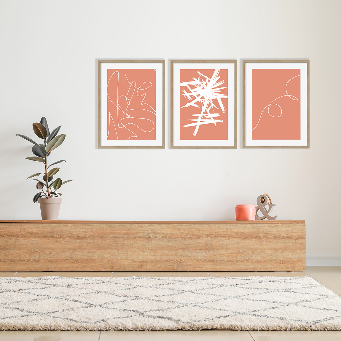
Coral Peach abstract illustrations by Abstract House. Photo: Abstract House
Influencing the fashion industry
The choice of the annual Pantone Color of the Year tends to influence a wide variety of industries, including, of course, the fashion industry. As Pressman pointed out: “The goal of the programme is to help companies and consumers better understand the power colour can have. We want to teach them how to leverage colour’s power and expressiveness to influence perception — whether it be to create a more successful design strategy that will increase consumer engagement, or to use it to better showcase your own personal identity.”
When it comes to Pantone’s trend predictions for the Autumn/Winter 2023/2024 New York Fashion Week, the Pantone team predict that ten standout colours, as well as the five new classics will influence the majority of fashion designers as they introduce their spring/summer collections.
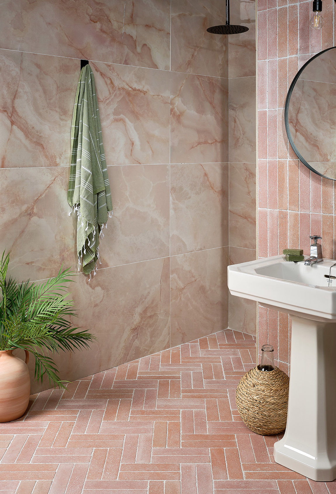
California porcelain by Ca’ Pietra. Photo: Ca’ Pietra
“Colours for NYFW Autumn/Winter 2023/2024 reach out beyond what we think is possible to catapult us into this new era, taking us to a place where boundaries of time, place, and identity are no longer fixed,” said Leatrice Eiseman, executive director of the Pantone Color Institute. “A friendly mix of joyful tones and traditional shades recontextualised with a modern edge, colours for NYFW Autumn/Winter 2023/2024 express a step up in tempo. Serving as a vehicle for vitality and enthusiasm, this season’s colours bring about limitless self-expression and encourage us to awake and enjoy the autumn/winter season.”
Concretely, designers will incorporate tender peach nuances, vivid magentas, oranges, yellows and pastel greens that go alongside traditional tones like milky whites and tawny browns with a modern edge.
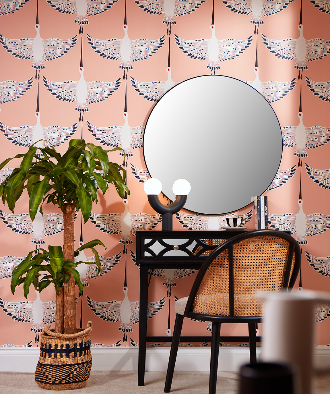
Ogata Kuren Peach Wallpaper by Lust Home. Photo: Lust Home
Previous Pantone Color of the Years:
2023 Viva Magenta 18-1750
2022 Very Peri 17-3938
2021 Illuminating 13-0647 & Ultimate Gray 17-5104
2020 Classic Blue 19-4052
2019 Living Coral 16-1546
2018 Ultra Violet 18-3838
2017 Greenery 15-0343
2016 Rose Quartz 13-1520 & Serenity 15-3919
2015 Marsala 18-1438
To find out more about the Pantone colours, go to:
www.pantone.com

Subscribe to Our Newsletter
Receive our monthly newsletter by email